
How to style the Step Navigation block (Tabbed and Next/Previous buttons)
The Step Navigation block controls how shoppers move between steps in a multi-step bundle. By default it shows numbered step markers, but you can switch its style to Tabbed pills or explicit Next / Previous buttons — useful if customers aren't realizing the step markers are clickable and are getting stuck on step 1.
This guide covers the Core template's V2 visual editor. It applies to the standalone Step Navigation block, not your theme header's own step indicator (see "A note on the header's step indicator" below).
Before you start
- Your bundle needs at least 2 steps.
- Your bundle must have been built using the Core Template.
- The Step Navigation block only appears once you're in a multi-step bundle — it has no effect on single-step bundles.
Find the Step Navigation block
- Open your bundle and select Launch design editor.
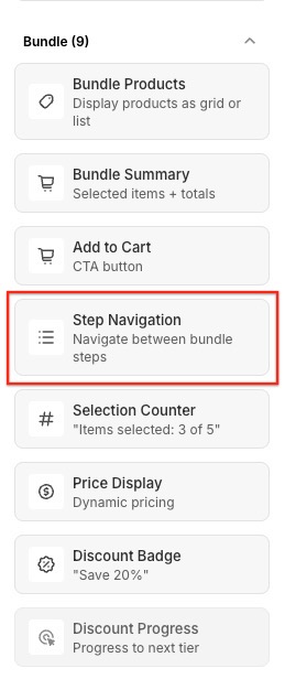
- If the canvas doesn't already have a Step Navigation block, from the Bundle category, and add Step Navigation. It renders numbered step markers by default.
- Select the block on the canvas to open its settings.
Style 1: Tabbed
Tabbed style replaces the numbered circles with pill-shaped tabs, with the active step's tab filled in — the same look as a tabbed bundle's navigation.
- In the block's settings, open the Style dropdown.
- Choose Tabbed.
With Tabbed selected, you can still use:
- Show step labels — shows each step's name next to its tab.
- Stack on mobile — stacks the tabs vertically on small screens instead of keeping them in a row.

Style 2: Next / Previous buttons
This style replaces the clickable markers entirely with a Previous and a Next button, so there's no ambiguity about how to move forward.
- In the block's Style dropdown, choose Next / Previous buttons.
Choosing this style swaps in a different set of settings, since "Show step labels" and "Stack on mobile" don't apply to a button pair:
- Show Previous button / Show Next button — turn either button off if you only want one direction. With one turned off, the remaining button stays on the side it would normally occupy rather than jumping to the middle.
- Show step names on buttons — shows the destination step's name (for example "Choose your base") instead of the word "Next" or "Previous".
- Show chevrons — adds a small arrow (< or >) next to the button text, pointing in the direction it moves.
- Alignment — choose Opposite ends (Previous on the left, Next on the right — the default), or Left, Center, Right to group both buttons together.

How the buttons behave
- Previous is hidden on the first step, and Next is hidden on the last step — there's never a dead button.
- If a step is conditionally hidden for a shopper, Previous/Next skip over it automatically.
- The buttons use your store's global button colors (the same colors as your Add to Cart button), so there's no separate text color setting for this style.
If a step has requirements
If the Bundle Products block's Disable section navigation setting is on, and a shopper hasn't met that step's requirement yet (for example, "add at least 1 product"), the Next button becomes disabled and greyed out until they do. Hovering over it shows the same requirement message shoppers see in the Requirements list, so they know exactly what's missing.
Changing the button and step labels
The words "Next" and "Previous" (and step names, if you've turned on "Show step names on buttons") come from your store's translation settings, not from the block itself. To reword them, go to Settings > Translations > Navigation & labels.
A note on the header's step indicator
Separately from the Step Navigation block, your bundle's Header settings have their own built-in step indicator with a Style choice of Numbered or Tabbed, plus a Sticky header option that pins it to the top of the screen as the shopper scrolls. This guide covers the standalone Step Navigation block, which offers more style choices (including Next / Previous buttons) but isn't sticky. If you're only using the header's built-in indicator today, you won't see these options until you add a Step Navigation block from the block library.
Troubleshooting
- I don't see "Next / Previous buttons" in the Style dropdown. Make sure you've selected the Step Navigation block itself (not the header's step indicator) — only the block offers this style.
- Next never seems to be disabled, even with unmet requirements. Check that Disable section navigation is turned on in the Bundle Products block's settings.
- The buttons don't match my brand colors. These buttons follow your store's global button color settings rather than a per-block color, so update your Add to Cart button color to change both at once.